MARKET FLASH:

"It seems the donkey is laughing, but he instead is braying (l'asino sembra ridere ma in realtà raglia)": si veda sotto "1927-1933: Pompous Prognosticators" per avere la conferma che la storia non si ripete ma fà la rima.


sabato 2 dicembre 2017

DB's "2018 Credit Outlook" - Killer Charts Point To Bearish Not Benign Conclusion

DB's Jim Reid has released his "2018 Credit Outlook". In our first pass on this 60-pager earlier, we noted that Reid characterised 2017 as the most "boring year ever", since it will go down as one of, if not the least, volatile year for the majority of asset classes.


Heading into 2018, Reid characterises risk assets as a tightrope walker who's successfully negotiated a hire wire since the 2008 crisis. However, the confidence of our risk asset funambulist was always fortified by the knowledge that there was a huge safety net direct beneath him in the shape of the central bank put. In Reid's own words.

The best analogy for our view on 2018 is that risk assets are like a highly skilled but still relatively inexperienced tightrope walker. Our tightrope walker started his career immediately after the GFC and earned his apprenticeship in very difficult conditions with lots of crosswinds but with the knowledge that a huge safety net existed beneath him. This allowed him to walk across the narrow line with slow but ever-increasing confidence, skill and aplomb. In our analogy the safety net is the central bank put that has continued to help financial markets' confidence over the last several years in spite of very challenging conditions.

As the tightrope walker steps from December 2017 into January 2018, he's going to notice a disconcerting change in his safety net.

However in 2018 our tightrope walker will have to move onto the next phase of his career where the structural support of the safety net will likely be slowly weakened. Every time he looks down he'll figuratively see a central banker loosen or take away a supporting rope. As such his skills and confidence are likely to be tested more than in recent years.

Reid is specifically referring to the growth in the size of the big four DM central bank balance sheets, i.e. the Federal Reserve, ECB, Bank of Japan and the Bank of England. At the end of 2017, the combined size of the big four's balance sheets is estimated to reach about $14.9 trillion, an increase of about $1.8 trillion on the end of 2016. That's about to change radically, as he notes.

Assuming fairly neutral and consensus assumptions, central bank balance sheet growth will fall sharply over the next 12-24 months from the near peak levels currently seen.

The chart below shows that on a rolling twelve-month basis, growth will fall sharply, beginning in 2Q 2018. By the end of 2018, DM estimates that the rolling twelve-month growth will have declined about 75% from its 2017 level to about $450 billion. By August 2019, growth will have declined to zero according to DB's estimate.


As the report notes, this "represents a changing of the guard for ultra-easy policy". The problem for Reid's tightrope walker is that he's come so far, there's no turning back, even if he knows the risk of a catastrophe is only going to increase for the best part of the next two years. From Reid's perspective, the threshold in terms of higher risk will be crossed as we move from Q2 2018 in the second half of next year.

So barring an external shock the ECB will be relatively dormant until late in Q2 when speculation will start to mount about what comes next after the current QE extension to the end of September 2018. DB's expectation is for a quick and full taper in Q4 and the first policy rate hike in June 2019. As such, as we approach the June meeting - which will probably be the earliest that any announcement will occur - more hawkish speculation will likely start to mount about the future of the program. Indeed by the time we get to H2 2018 we'll potentially be seeing a very different global QE picture to that we've been used to in the recent past. By then the Fed will be well into its gradual, but slowly increasing run down of its balance sheet.

As the report notes, the slowdown in QE purchases in 2017 will likely coincide with significantly different conditions to the most recent example in 2014-15.

While markets went through similar balance sheet wind downs through 2014 and into 2015 - driven predominantly by the Fed and ECB - not only was the stock of global QE lower with less central banks conducting such operations, we also had a situation where the tapering was consistent with a reduction in government issuance.

Fast forward to 2018 and a reduction of purchases across the globe could be occurring at a time when there is a move to increase government spending even if this isn't yet showing up in the forecasts. The US tax plans haven't been finalized as we go to print but an unfunded tax cut is our base case which will add to the deficit and eventually to treasury issuance. In the UK the budget - seen just before we went to print - included some loosening of the fiscal purse, as the current administration deal with Brexit risks and a population tired of austerity. Even in Germany, the recent election uncertainty and eventual coalition could include some fiscal stimulus.

So we think the tide is turning away from ultra-loose monetary and relatively tight fiscal even if the official fiscal forecasts from most commentators are yet to include much in the way of easing across the globe.

Reid backs up his forecasts with charts for the three key central banks, firstly the Federal Reserve and the Bank of Japan. The chart for the Fed shows that its purchases of Treasuries have never exceeded net supply. In contrast, the BoJ has exceeded net supply during the last four or so years of Abenomics, although the ratio has stabilised at around three times.


Turning to the ECB, the change in ECB purchases versus net issuance will be dramatic as 2018 unfolds.


Reid argues that.

Interestingly, if we look at the Fed, BoJ and ECB Government bond purchases versus net supply of domestic Government bonds we can see how the ECB's removal of QE could be very different to that of the Fed relative to when it started tapering. In addition the supply/demand dynamic for European Government bonds has recently been even more extreme than in Japan…as ECB purchases have recently been seven times net issuance at their recent peak.

So in other words we've seen the huge PSPP volume far outstrip the relatively negligible net issuance in the Euro area. While the Fed program was clearly huge in absolute terms, relative to supply it was much more modest. It also declined along with Treasury issuance meaning that yields could be sheltered from the tapering impact.

In Europe we could see government bond QE go from seven times net issuance in Q3 2017 to more in line with it by the end of 2018. As the realisation mounts that ECB QE withdrawal is much more significant in relative terms to that seen in the US in 2014 then fixed income markets could become more vulnerable which may in turn create more volatility and more difficult conditions for credit spreads.

Which…unless we are missing something…sounds very bearish for European credit.

Nonetheless, when it comes to the DB team's central case for credit spreads in 2018, they are relatively benign. Indeed, DB expects a tightening in Q1 2018, followed by a modest widening from Q2 2018 to the end of the year.


As the report notes, team member "Craig" is more bearish than his colleagues and his views seems more in keeping with the general thrust of the report.

Combining the net purchases versus net issuance data for the Fed, ECB and BoJ, Reid notes.

When we combine these three central bank purchases with net issuance historically in Figure 18 we can see just how supportive the technicals have been for government bonds. This is seemingly peaking out at the end of 2017 and with our forecasts for central bank purchases and a continuation of the 2013-2017 reduction in Government bond net issuance we expect this now to reverse. For choice we think fiscal spending will start to pick up which means these net issuance estimates are probably too aggressive on the downside.


Once again, the correct conclusion would seem to be bearish, although DB seems reluctant to go there. We are even more perplexed when DB cites the risk that inflation will surprise on the upside.

Meanwhile we think the risks to inflation are on the upside…will likely mean that crosswinds pick up as we move through Q2 and into H2 – a period where US inflation might start to more consistently beat on the upside (or at least not consistently miss on the downside) and markets start to think about a June ECB meeting where the end of Euro QE is possibly announced.


Returning to his metaphor of the tightrope walker, DB notes the probability of him remaining on his wire will deteriorate as the year progresses.

If we're correct on inflation it's going to be difficult for central bankers to justify anything other than the slow and steady removal of the safety net beneath our intrepid tightrope walker. As such his task will get more difficult purely because his confidence must surely weaken with more risks associated with any fall. As such he's likely to wobble more. So expect volatility to finally start to increase after surprising many by staying as low for as long as it has done. At this stage the tightrope walker may have enough skill to safely navigate across to the next point (end 2018), however the probabilities of such a successful outcome are likely to be getting lower as the year progresses.

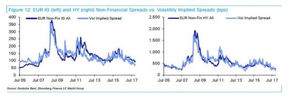
Perhaps Reid has been dissuaded from taking a more bearish stance by the ultra-low environment for volatility which he noted had made 2017 so boring. Indeed, he notes the close correlation between major asset volatility levels and credit spreads.


As we noted in our first pass on DB's "2018 Credit Outlook"

Reid joins countless other strategists opining on the lack of vol in the past year, asking "why has volatility been so low and can it continue?" His answer is that the most likely reason for volatility being so low is a combination of: 
Synchronised and firm global growth; 
Inflation that has consistently been in the 'Goldilocks' range and not accelerating as much as expected in 2017, and; 
Global central bank liquidity which in 2017 has still been close to peak levels. 

What Reid neglected to mention is that volatility has itself become a tradeable input – making it reflexive in nature - and one which has been shorted to insane levels, both implicitly and explicitly.

The rapid elimination of the central bank security net coupled with rising inflation are transforming the risk profile for Reid's tightrope walker, as he acknowledges, and one where the chances of a sustained spike in volatility must be commensurately higher. We know from his writings that Reid is a big Liverpool (soccer) fan, as are we. It's been a frustrating season so far. So often, the build-up play has been excellent while putting the ball in the back of the net has been elusive. We felt like this about DB's otherwise impressive report.

Five Charts That Show We Are on the Brink of an Unthinkable Financial Crisis

Bonfires are fun to watch, but they eventually burn out.


Human folly apparently doesn't, so we just keep adding to the absurdities. The volume of daily economic lunacy that lights up my various devices is truly stunning, and it seems to be increasing.

Let's take a look at a series of charts I received from my "kitchen cabinet" of friends.

The Economy Is More leveraged Than Ever

First up is G. Williams who sent a monumental slide deck. Here is just one example of craziness.


Source: G. Williams

This chart is straightforward: It's outstanding credit as a percentage of GDP. Broadly speaking, this is a measure of how leveraged the US economy is.

It was in a sedate 130%–170% range as the economy industrialized in the late 19th and early 20th centuries. It popped higher in the 1920s and 1930s before settling down again. Then came the 1980s. Credit jumped above 200% of GDP and has never looked back.

It climbed steadily until 2009 and now hovers over 350%.

Absurd doesn't do this situation justice. We are mind-bogglingly leveraged. And consider what the chart doesn't show. Many individuals and businesses carry no debt at all, or certainly less than 350% leverage. That means Many others must be leveraged far higher. While lending has been a very lucrative business in recent decades, it's hard to believe it can last. At some point we must experience a great deleveraging. When that happens, it won't be fun.

Cash Allocation Is Lowest Since 2007

"Contrarian" investors believe success lies in going against the crowd, because the crowd is usually wrong. My own experience suggests one small adjustment: Pay attention not to what the crowd says but to what it does. Words are cheap.

This next chart is a prime example.

We see here the amount of cash held by Merrill Lynch clients from 2005 to the present, as a percentage of their assets. The average is about 13%.


Source: Fasanara Capital

The pattern is uncanny. In 2007, as stock indexes reached their peak, cash holdings were well below average. They rose quickly as the crisis unfolded, peaking almost exactly with the market low in early 2009.

In other words, at the very time when it would have been best to reduce cash and buy equities, Merrill Lynch clients did the opposite. And when they should have been raising cash, they kept their holdings low. I don't think this pattern is unique to Merrill Lynch's clients; Market timing is hard for everyone.

The disturbing part is where the chart ends. Merrill Lynch client cash allocations are now even lower than they were at that 2007 trough. Interest rates are much lower, too, so maybe that's not surprising.

Central banks spent the last decade all but forcing investors to buy risk assets and shun cash. This data suggests it worked. But whatever the reason, investor cash levels suggest that caution is quite unpopular right now.

So if you consider yourself a contrarian, maybe it's time to raise some cash.

Michael Lewitt's Reality Check

Michael Lewitt's latest letter came in this morning. He began with the marvelous Ralph Waldo Emerson quote that I used at the beginning of this letter, and then he helpfully contributed this list of absurdities:

Anyone questioning whether financial markets are in a bubble should consider what we witnessed in 2017:

• A painting (which may be fake) sold for $450 million.

• Bitcoin (which may be worthless) soared nearly 700% from $952 to ~$8000.

• The Bank of Japan and the European Central Bank bought $2 trillion of assets.

• Global debt rose above $225 trillion to more than 324% of global GDP.

• US corporations sold a record $1.75 trillion in bonds.

• European high-yield bonds traded at a yield under 2%.

• Argentina, a serial defaulter, sold 100-year bonds in an oversubscribed offer.

• Illinois, hopelessly insolvent, sold 3.75% bonds to bondholders fighting for allocations.

• Global stock market capitalization skyrocketed by $15 trillion to over $85 trillion and a record 113% of global GDP.

• The market cap of the FANGs increased by more than $1 trillion.

• S&P 500 volatility dropped to 50-year lows and Treasury volatility to 30-year lows.

• Money-losing Tesla Inc. sold 5% bonds with no covenants as it burned $4+ billion in cash and produced very few cars.

This is a joyless bubble, however. It is accompanied by political divisiveness and social turmoil as the mainstream media hectors the populace with fake news. Immoral behavior that was tolerated for years is finally called to account while a few brave journalists fight against establishment forces to reveal deep corruption at the core of our government (yes, I am speaking of Uranium One and the Obama Justice Department). In 2018, a lot of chickens are going to come home to roost in Washington, D.C., on Wall Street, and in the media centers of New York City and Los Angeles. Icons will be blasted into dust as the tides of cheap money, cronyism, complicity, and stupidity recede. Beware entities with too much debt, too much secrecy, too much hype. Beware false idols. Every bubble destroys its idols, and so shall this one.

The Fed's Balance-Sheet Unwind Spells Trouble

The next absurdity is absurd because it is so obvious, yet many don't want to see it. Too bad, because I'm going to make you look.

This comes from Michael Lebowitz of 720 Global. It's the S&P 500 Index overlaid with the Federal Reserve's balance sheet and the forecast of where the Federal Reserve intends to take its balance sheet.


Source: 720 G.

The Fed and other central banks have practically forced investors into risk assets since 2008. You can see the relationship very clearly in this chart. The green segments of the S&P 500's rise occurred during quantitative easing programs.

Correlation isn't causation, but I think we can safely draw some connections here.

Ample low-cost liquidity drives asset prices higher. That's not controversial. It makes perfect sense that the withdrawal of ample low-cost liquidity would also impact asset prices in the opposite direction.

The Fed has even given us a schedule by which it will unwind its balance sheet. Michael's chart gives us a sense of how far the S&P 500 could drop if the Fed unwinds as planned and if the relationship between liquidity and stock prices persists. Either or both of those could change; but il they don't, the S&P 500 could fall 50% in the next few years.

Volatility-Linked Hedges Won't Deliver in a Flash Crash

Many investors see all these warning signs but think they can keep riding the market higher and hedge against losses at the same time. It doesn't really work that way.

Wall Street firms have rolled out all kinds of volatility-linked products that purport to protect you from sudden downside events. Most of these products are linked to the Volatility Index, or VIX.

Volatility has been persistently low as the market has risen in recent years. That has made it cheap to buy protection against a volatility spike. However, it's not clear if the sellers of this protection will be able to deliver as promised.

My friend Doug Kass has been concerned about this for some time. He believes the risks of a "flash crash" are rising, and those who think they are hedged may learn that they are not.

He shared this Morgan Stanley graphic of how many VIX futures contracts would have to be bought to cover a one-day market drop.


Between hedgers, dealers, and ETP sponsors, a one-day 5% downward spike in the S&P 500 would force the purchase of over 400,000 VIX futures contracts. This was in October, and the figure has probably risen more since then. Doug isn't sure a market under that kind of stress can deliver that much liquidity.

I suspect the various VIX-linked products will disappoint buyers when the unwind occurs.

High-Yield Debt Might Be a Trigger for the Next Crisis

Doug also shared what will be the final graph for this week and observed, "This is the dreaded alligator formation, and the jaws always close."

It's just a matter of time. It could take another year and get even sillier, but when that gator snaps its jaws shut, a lot of people will get bitten.

I personally think the bubble in high-yield debt, accompanied by so much convenant-lite offerings, will be the source of the next true liquidity crisis.


Source: Z.H.

The amount of money available to market makers to use to maintain some type of order in a falling high-yield market is absurdly low. Investors in high-yield mutual funds and ETFs think they have liquidity, but the managers of those funds will be forced to sell into a market where there is no price and there are no bids.

Oh, the bids will show up at 50% discounts. Distressed-debt funds and vulture capital will see opportunities, and they will be there. Talk about blood in the streets.

Wonder Who Was Buying Yesterday's Market Breakout? Here's The Answer


Wonder who was buying the euphoria blow-off top stock market breakout yesterday? One clear answer, according to Nicholas Colas of DataTrek Research, is answer is "Mom and Pop". Nick looked at the publicly available trade data on Fidelity's retail website and found net buy orders across both single stocks (mostly tech) and ETFs. And, no surprise, some bitcoin names as well. 

Here's what else Nick discovered.

Retail investors have lost some of their reputation for being the "Dumb money" over the last few years. After all, anyone "Dumb" enough to own the largest US listed ETF (SPY) or the biggest tech names (AAPL, GOOG, etc) has done very well for over half a decade. 

Still, whenever we see a big up day for US stocks, we can't help but wonder what the retail investor is buying when stocks hit (yet another) all time high. Are they getting cautious and lightening up? And what names do they still like? 

Fidelity Investments lets you see their customers' Top 10 names traded, in real time if you have an account and one day-delayed if you don't. 
Here's some color on today's market action, courtesy of that information source: 

  • Fidelity's retail accounts were net buyers in 9 out of the top 10 names traded by their customers. The only exception: Kroger. 
  • Tech names held the top 4 positions in terms of total order volumes. Ranked by total activity, they were: Nvidia, Micron Technology, Apple and Amazon. 
  • In a not-so-surprising fifth spot: GBTC. Not familiar with that symbol? It is the Grayscale Bitcoin Investment Trust, and it trades over at OTC Markets. It was better to buy today at Fidelity by a ratio of 1.5:1. Just as notable: it trades at a 70% premium to bitcoin.
  • The balance of the top 10 names traded are predominantly tech as well: Alibaba, Square, and Facebook. Non-tech names were Kroger and Bank of America. All were better to buy except, as just mentioned, Kroger. 

A few other comments from the Top 25 list, available to customers: 

  • There are surprisingly few ETFs. The only ones listed: UGAZ (3x Long Natural Gas), SPY and UVXY (2x the VIX). That challenges the notion that retail investors only buy ETFs – clearly there is still significant interest in single names. 
  • Fidelity customers don't seem to be fans of brick and mortar retailers, with a greater number of sell than buy orders today for Costco and Macy's. 

The upshot: Fidelity's customer base is representative of the retail investor, and this group is certainly still a net buyer of US equities. Even on a day of all-time-highs. Call them "Dumb money" if you want… But they've been right for a long time and they seem perfectly content to "Buy the breakout" as much as "buy the dip."