MARKET FLASH:

"It seems the donkey is laughing, but he instead is braying (l'asino sembra ridere ma in realtà raglia)": si veda sotto "1927-1933: Pompous Prognosticators" per avere la conferma che la storia non si ripete ma fà la rima.


sabato 26 agosto 2017

Stock & Bond Markets in Denial about QE Unwind, but Banks, Treasury Dept Get Antsy


"Let markets clear." It'll be just "a financial engineering shock."

Stock and bond markets are in denial about the effects of the Fed's forthcoming QE unwind, whose kick-off is getting closer by the day, according to the minutes of the Fed's July meeting.

"Several participants" were fretting how financial conditions had eased since the rate hikes began in earnest last December, instead of tightening. "Further increases in equity prices, together with continued low longer-term interest rates, had led to an easing of financial conditions," they said. So something needs to be done about it.

And "several participants were prepared to announce a starting date for the program at the current meeting" – so the meeting in July – "most preferred to defer that decision until an upcoming meeting." So the September meeting. And markets are now expecting the QE unwind to be announced in September.

Since then, short-term Treasury yields have remained relatively stable, reflecting the Fed's current target range for the federal funds rate of 1% to 1.25%. But long-term rates, which the Fed intends to push up with the QE unwind, have come down further. As a consequence, the yield curve has flattened further, which is the opposite of what the Fed wants to accomplish.

The chart shows how the yield curve for current yields (red line) across the maturities has flattened against the yield curve on December 14 (blue line), when the Fed got serious about tightening:


Yields of junk bonds at the riskiest end (rated CCC or below) surged in the second half of 2015 and in early 2016, peaking above 20% on average, as bond prices have plunged (they move in opposite directions) in part due to the collapse of energy junk bonds, which caused a phenomenal bout of Fed flip-flopping. But by rate-hike-day December 14, the average yield was 12%. And since the tightening moves and the planning for the QE unwind, the yield has dropped to 10.7% currently:


So markets are loosening "financial conditions" for companies, thus making capital cheaper and easier, rather than tightening financial conditions. The St. Louis Fed tracks these financial conditions with its "Financial Stress Index." In this chart of the Financial Stress Index, the blue line (=zero) represents "normal financial market conditions." Values below zero indicate below-average financial market stress. The record low was -1.609 on June 27, 2014. Currently, the index is at -1.604, just barely above the record low:


In other words, financial conditions have almost never been easier despite the current series of tightening moves. And this is what it looks like in more granular detail:


Stocks are still near all-time highs, though they've come down a tad. Interest rates for conforming 30-year mortgages are still quoted below 4%, thus propping up the housing market, despite the Fed's plan to begin shedding its portfolio of mortgage-backed securities, which it acquired over the years specifically to push down mortgage rates.

After a 12-month phase-in period, the Fed will reduce its balance sheet by up to $50 billion a month in Treasuries and mortgage-backed securities, every month, with clock-work regularity. That's the plan. By $600 billion a year or $1.2 trillion in two years. QE was designed to bring yields down and inflate asset prices. Now the opposite is being planned, and markets are just blowing it off.


No one knows how this will turn out. The Fed has never done a QE-unwind before. But folks are concerned. A committee of investors and banks – the Treasury Borrowing Advisory Committee or TBAC – pointed out some of those risks in its presentation to Treasury Department earlier this month.

They pointed out, for example, that the corporate and government borrowing costs are likely to rise. At the riskier end, borrowing costs could rise significantly. In addition, the federal government's borrowing needs is also expected rise, Jason Cummins, TBAC chairman, wrote in the letter to Treasury Secretary Steven Mnuchin. So just when the Fed is cutting its balance sheet and the cost of borrowing rises, the amounts to be borrowed by the government are expected to increase.

"The private sector piggy-backed on the Fed's large-scale asset purchases, a move that promoted a surge in corporate borrowing and tighter risk spreads," Cummins wrote. "In an adverse scenario, there's the possibility of a meaningful, but not systemically risky, decline in both credit and equities."

It would be a "tail risk" the presentation said. It could entail accelerating "risk premium decompression," where "small increases in yields can potentially lead to large changes in risk premium." Which means large-scale declines in the prices of riskier bonds, and thus far higher borrowing costs for those issuers, and a big hit to stocks. The presentation:

Pro-cyclical behavior of investors who 'piggy backed' central bank purchases and ECB tapering are possible accelerators to the rise in US risk premium in a tail risk event.

"There may be a "meaningful decline in risk assets." But it's not going to be "systemic," it said. "Banks and households have not leveraged to higher asset prices." They can withstand the shock. So "Let markets clear." It's just "a financial engineering shock."

Given how corporate bonds are now largely held by exchange-traded funds and mutual funds, this could get even more interesting. When bond prices decline, investors in those funds – painfully aware of the first-mover advantage experienced in prior bond-fund collapses – will be getting out of these funds, and funds have to sell bonds to meet the redemptions. At that point, bond market liquidity dries up, and this selling by funds will accelerate the pressures. And yet, bond and stock markets are still euphoric.

mercoledì 9 agosto 2017

The Perfect Crash Indicator Is Flashing Red

What’s the last big toy you buy when things have been good for a really long time and you already have all the other toys? An RV, of course. A dubious thing to own if you already have a house, but when the good times seem likely to roll on forever, why the hell not?
And what’s the first thing you sell when you lose your job and your stocks are tanking? That very same RV. Which makes new RV sales a useful indicator of our place in the business cycle.
What does it say now? Here you go:
Notice the mini-spike in the late 1990s and the major spike in mid-2000s, both of which were followed by corrections. Now note the mega-spike from 2010 and 2016.
And how are things going so far this year? Well, the space is on fire:

‘The RV space is on fire’: Millennials expected to push sales to record highs

(CNBC) – RV shipments are expected to surge to their highest level ever, according to a forecast from the Recreation Vehicle Industry Association.
It would be the industry’s eighth consecutive year of gains.
Thor Industries and Winnebago Industries posted huge growth in their most recent earnings report.
Those shipments are accelerating, and should grow even more next year, the group said. Sales in the first quarter rose 11.7 percent from 2016.
Much of the growth can be attributed to strong sales of trailers, smaller units that can be towed behind an SUV or minivan, which dominate the RV market. The industry also is drawing in new customers.
As the economy has strengthened since the Great Recession, and consumer confidence improved, sales have picked up, said Kevin Broom, director of media relations for RVIA.
Two of the major players in the industry, Thor Industries and Winnebago Industries, both manufacturers of RVs, reported huge growth in their most recent earnings report. Thor saw sales skyrocket 56.9 percent to $2.02 billion fromlast year. Winnebago’s surged 75.1 percent last quarter to $476.4 million.
Gerrick Johnson, an analyst at BMO Capital Markets, attributed much of that growth to acquisitions. Thor bought Jayco, then the No. 3 player in the industry, last June; Winnebago bought Grand Design in October.
Thor stock has experienced strong growth over the past year of almost 40 percent. Winnebago tells an even better story: Its shares are up 56 percent over the past 12 months.
“They’ve done massively well because they’ve made massively creative acquisitions,” said Johnson. “Wall Street didn’t realize how creative those deals were. Each quarter they came through. The RV space is on fire, and the demand metrics are quite positive.”
What we have here is another classic short. During the past couple of recessions, RV stocks plunged as everyone came to their senses and stopped buying $60,000 motel rooms. Based on the above chart that’s a pretty good bet to repeat going forward. Let’s revisit this play in a couple of years.

The Dollar And Equities Will Plunge Together – While Gold Spikes

The dollar has been falling lately, which isn’t what a lot of people expected with the Fed being the only major central bank that’s raising interest rates. Higher yields on dollar balances should, according to basic economics, have attracted foreign capital to Treasury paper, thus putting upward pressure on the dollar. Didn’t happen though. The dollar is down about 10% since the Fed started tightening.
Stocks, meanwhile, might reasonably have been expected to fall, as their dividend yields become less attractive relative to rising risk-free fixed income returns. Also didn’t happen. US equities are now at record levels.
As for what happens next, Ron Rosen of the Rosen Market Timing newsletter has just published some dramatic predictions. Here’s an excerpt:
This REPORT attempts to demonstrate that the day the Dollar Index crosses beneath the 91.88 level will probably be the beginning of a collapse in the stock averages and a massive rise in the precious metals complex.
The completion of the 9 year Zig-Zag correction in the Dollar Index is telling us that D-Day will take place the day that the Dollar Index crosses beneath the 91.88 low. The following is an explanation of a Zig-Zag correction.
Excerpts from the NASDQ description of a Zig–Zag correction: “Zig zags look like a lightning bolt on the chart. There are 2 rules for zig zags: 1. The sub waves of an A-B-C zig zag appear as 5-3-5 2. Wave B of the zig zag cannot retrace 100% of Wave A – most of the time wave B retraces 38-78% of wave A The 3 waves of the zig zag (A-B-C) subdivide as a 5-3-5 meaning the ‘A’ leg has 5 sub waves in it, the ‘B’ leg has 3 sub waves in it, and the ‘C’ leg has 5 sub waves in it. As a result of the ‘A’ and ‘C’ legs both containing 5 sub waves each, the impact of the whole zig zag structure is to be a deep retracement and recover a lot of price from the previous trend. Also, the zig zag was designed to make progress against the trend. Therefore, wave B of a zig zag can be any 3 wave pattern (including another zig zag), but wave B cannot retrace 100% of wave A. A retracement of 99% is acceptable, though unlikely and progress needs to be made.”
It is as obvious as anything can be that the Dollar Index underwent a 9 year zig-zag correction that began in the June quarter of 2008. The zig-zag correction was complete at the high of 103.815.
The S&P 500 and the Dow Jones Industrial Average accompanied the Dollar Index on its huge corrective zig-zag rise. It is highly probable that they will accompany the Dollar Index on its coming collapse.
Gold bullion as representative of the precious metals complex has bottomed and completed its first minor rally. Its explosive move up waits in anticipation of the crossing of the 91.88 level for the Dollar Index.
The XAU as representative of the precious metal shares is in the same bullishly explosive position as gold bullion.
If something like this happens there will be all kinds of fundamental explanations (to go with the technical one outlined above), including political turmoil in the US and abroad, divergent central bank monetary policies and rising geopolitical tensions in Asia and the Middle East.
But the truth will be simpler: This bull market in financial assets has continued for far too long on the back of artificially easy money, something that is by its nature unsustainable. So it eventually had to end and now is that time.

Also nearly certain is that when a currency/stock market crisis finally hits it will be met with a truly breathtaking set of central bank asset buying programs. QE was big, but the equity, corporate bond, and (possibly) real estate buying binge that comes next will put it to shame.

When the "Fix" Increases Systemic Fragility, Things Fall Apart? It's going....


All the "fixes" have fatally weakened the real economy, and created a dangerous illusion of "wealth," "growth" and solvency. The "fix" of the last eight years worked, right? This was the status quo's "fix":

1. Massive expansion of debt: sovereign, household and corporate, all in service of a) bringing consumer demand forward b) fiscal stimulus funded by debt c) corporate stock buybacks to boost stock valuations d) asset bubbles in real estate, bonds, stocks, bat guano futures, etc.
2. Monetary stimulus, i.e. creating and distributing money at the top of the wealth/power pyramid so corporations and the super-wealthy could buy more assets with free money for financiers issued by central banks.
3. Gaming statistics such as unemployment and metrics such as stock indices to generate the illusion of "growth," "stability" and "wealth."
4. Saying all the right things: the "recovery" is creating millions of jobs, inflation is low, virtue-signaling is more important than actual increases in inflation-adjusted wages, etc.

This "fix" has fatally weakened the real economy. The cost of maintaining the illusions of "growth," "stability," "wealth" and solvency is extremely high, and hidden from view: systemic fragility has increased to the point of brittleness. What is fragility? Fragility is the result of an erosion of resilience, redundancy, adaptability, accountability, honesty, feedback and willingness to sacrifice today's consumption for tomorrow's productivity and systemic stability. The status quo "fix" has gutted resilience, redundancy, adaptability, accountability, honesty, feedback and willingness to sacrifice today's consumption for tomorrow's productivity. The status quo is now like a wafer-thin sheet of ice over a deep lake of killing-cold water. To the naive and inexperienced, the ice looks solid; they believe the tall tales of "recovery," growth," "wealth" and solvency. It's all phony public relations. PR doesn't make thin ice thick enough to stand on.


Gravity eventually overpowers financial fakery. When debt-asset bubbles expand at rates far above the expansion of earnings and real-world productive wealth, their collapse is inevitable

The Supernova model of financial collapse is one way to understand this. A Supernova analogy can properly explain why it illuminates the dynamics of financial bubbles imploding. According to Wikipedia, "A supernova is an astronomical event that occurs during the last stellar evolutionary stages of a massive star's life, whose dramatic and catastrophic destruction is marked by one final titanic explosion.". A key feature of a pre-supernova super-massive star is its rapid expansion. As the star consumes its available fuel via nuclear fusion, the star's outer layer expands. Once there is no longer enough fuel/fusion to resist the force of gravity, the star implodes as gravity takes over. This collapse ejects much of the outer layers of the star in an event of unprecedented violence. The financial analogy is easy to see: when rapidly expanding debt consumes a critical threshold of earnings (fuel), the equivalent of gravity (default, inability to service the enormous debt) triggers the collapse of the entire debt/leverage-dependent financial system. If earnings stagnate or decline while debt races higher, eventually earnings are insufficient to service the debt and default is inevitable. The other problem that arises as more and more of earned income goes to debt service is that there is less and less disposable income left to support consumer spending--the lifeblood of economies worldwide. Once debt service absorbs a significant chunk of household earnings, recession is the inevitable result as spending collapses once more debt cannot be loaded on households. In other words, debt is limited by earnings. If earnings decline, or fall far behind the expansion of debt, eventually borrowers can no longer borrow more, or refuse to borrow more. At that point, consumer spending falls and recession generates a self-reinforcing cycle of declining sales, profits, employment and wages. Recession further reduces the ability and appetite for more debt, and this acts as "gravity".

Why The Markets Are Overdue For A Gigantic Bust It's just not possible to print our way to prosperity - part 1


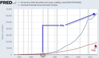
Let's begin with a caveat: confirmation bias is an ever-present risk for analyst as we are. Based on lots of historical inputs, we may anyway conclude that rinting money out of thin air can engineer lots of things, including asset price bubbles and the redistribution of wealth from the masses to the elites. But it cannot print up real prosperity. As much as I try, I simply cannot jump on the bandwagon that says that printing up money out of thin air has any long-term utility for an economy. It's just too clear to me that doing so presents plenty of dangers, due to what we might call 'economic gravity': What goes up, must also come down. Which brings us to the enclosed chart. The 200 bubble blown by Greenspan was bad, the next one by Bernanke was horrible, but this one by Yellen may well prove fatal. At least to entire financial markets, large institutions, and a few sovereigns. It's essential to note that more than two-thirds of the net worth tracked in the above chart is now comprised of ‘financial assets.’ That is, paper claims on real things. As the central banks have printed with abandon over the past decade, they’ve created the most extreme gap between real things (GDP) and the claims on those same things (Net Worth) in all of history. Following the Great Recession, the ‘plan’ of the central banks, such as it was, seems to have been to jam up people’s paper wealth, under the theory that people who feel wealthier are more likely to spend more and hopefully borrow more, too. That plan has worked rather well, at least from the standpoint of creating vastly larger amounts of new borrowing (debt and credit). But "how much GDP growth has resulted?" Not that much.The gap between the two only grows and grows at this point. And the central banks are now stuck at this point. They literally have no idea how to undo this problem they've managed to create. At some point that gap is going to have to close. 

The Market Has Never Done This Before

A fascinating statistic about the current no-vol state of the market, courtesy of Deutsche's Jim Reid, who points out that the last time we had 13 consecutive days in which the S&P moved less than 0.3% in either direction was... never: "... all you really need to know about markets at the moment is that yesterday's move in the S&P 500 (+0.16%) added to the record daily run of less than 0.3% moves in either direction. It’s now 13 days since we had a larger move using daily data back to 1927. The second longest streak of this length was of 10 days which has happened twice in history. The most recent time was in England's solitary football World Cup winning year (06 Jan 1966 - 19 Jan 1966), and the other between 15 Nov 1961 and 29 Nov 1961. So these continue to be remarkable financial times we are living through". Visually (see chart below). Another way of showing the chart reported below is with the S&P's closing prints over the same period: 2474, 2473, 2473, 2470, 2477, 2478, 2475, 2472, 2470, 2476, 2478, 2472, 2477, 2481. And here is some more from Reid: "To put the steady but relentless rally in the S&P in context, it is now 73 trading days since the S&P increased by more than 1% in any one day. Give it another 7 days and we will beat the prior record set back in November 06 and March 07. Although, given the current lull in the activity (VIX now back to below 10), we might even get close to the 100 day record set back in mid-July 1995 to early Dec 1995". Finally, this from BofA: "Earlier this year, the Dow recorded its lowest one-month trading range since 1900, and last summer the S&P traded within a 1.77% range for 42 consecutive days, the tightest such streak in history (the lull was ultimately broken on 9-Sep-16, when the S&P 500 dropped 2.45% on ECB policy, North Korea, and a fear of higher rates in the US).This is just another piece of evidence for Canaccord's thesis that traders are are not complacent, they are simply "paralyzed." Ready for the next plunge?


A chart is worth thousand of words: a key chart not enough seen and stared at.......

A chart is worth thousand of words. That's really true!! If anyone can make a good argument that USA is not in very serious debt trouble, I would love to hear it. And remember, the figures in the included chart don’t even include corporate debt. They only include government debt on the federal, state and local levels, and all forms of personal debt. So are they ready to share the debt accumulated burden?
Nobody that I know could write that kind of a check without sweating. The truth is that as a nation USA seems flat broke. The only way that the game can keep going is for all of them to borrow increasingly larger sums of money, but of course that is not sustainable by any definition.
Eventually they're (and us) going to slam into a wall and the game will be over.
One of my pet peeves is the national debt. USA politicians spend money in some of the most ridiculous ways imaginable, and yet no matter how much we complain about it nothing ever seems to change. For example, the U.S. military actually spends 42 million dollars a year on Viagra. Yes, you read that correctly. 42 million of US taxpayer's dollars are being spent on Viagra every year. And overall spending on “erectile dysfunction medicines” each year comes to a grand total of 84 million dollars… According to data from the Defense Health Agency, DoD actually spent $41.6 million on Viagra — and $84.24 million total on erectile dysfunction prescriptions — last year. And since 2011, the tab for drugs like Viagra, Cialis and Levitra totals $294 million — the equivalent of nearly four U.S. Air Force F-35 Joint Strike Fighters. Is this really where US spending on “national defense” should be going? USA figures are nearly 20 trillion dollars in debt, and yet they continue to spend money like there is no tomorrow.......