venerdì 20 ottobre 2017

Krinsky: We're Seeing a Global Market Breakout

Jonathan Krinsky, Chief Market Technician for MKM Partners, tells that markets are breaking out across the globe and there's little evidence we are at or near any sort of top.

Seasonal Expectations May be Myths

Though we typically see deeper corrections come in September and October, so far, it's looking like smooth sailing on Wall Street.

"We have to remember that we're in a very strong uptrend, and that's been the case for over a year now," Krinsky said.

Though August and September are on average the worst months for the year, from a historical perspective, these apparent trends actually tend to be anomalies, Krinsky stated.

"If we go back the last 30 years or so, October has only marked a major peak or the intra-year high one or two times," he said. "October gets more of a bad rap, but it actually tends to be a fairly decent month, especially when we're in strong uptrends like we are now."
Indices in Sync

With smaller caps stocks now doing well and keeping up with large caps, which have been leading the way through the summer, everything seems to be coming together for more bullishness.

This is the hallmark of a strong bull market, Krinsky stated. One group or area of the market does well, then cools off as money finds its way into another part of the market.

From December 2016 until only a few weeks ago, the small caps didn't really go anywhere this year, he noted. They were in a narrow trading range consolidating, and then we saw a large move out of that range a few weeks ago.

"We're seeing the money move and different areas of the markets participate," he said. "That's generally constructive. … As long as there's rotation and many parts of the market are participating, I think you have to maintain a bullish bias."
International Participation Apparent

For the first time in a long time, we're also seeing international markets get in on the equity bull.

Many countries are breaking out or are already in established uptrends, Krinsky stated. If we look back at 10- or 15-year charts, the rest of the world hasn't done anything like this in that time period.

We can argue that we're getting long in the tooth in the U.S. if we count the bull market as beginning in 2009, which is somewhat misleading in itself, Krinsky noted. But outside of the U.S., markets are having a good run this year, which has only returned them to the highs of the trading range they've been in for the last 10 years.

Krinsky isn't eager to spin a story to explain this bullishness, however.

"There always seems to be a narrative," he said. "We'll leave the narrative for people smarter than us. … Markets go through cycles. … You can put forward whatever narrative you want to make the case why it's happening, but I think it's much more important, especially if you're managing a portfolio, to pay attention to what is happening."

Right now, that "what" is a global breakout.
Where Is Value Right Now?

Krinsky advocates keeping a bullish stance and sticking with leading and offensive sectors, such as financials and technology.

These have been working back and forth together, he noted. When interest rates have headed down, we've seen a shift into growth for the technology names, and when rates start to move up, some of the financials have done better.

Both sectors can ratchet higher, especially into year-end, Krinsky added. Also, good things appear to be happening with industrials and healthcare.

On the flip side, some places to be defensive include consumer staples and utilities. Consumer staples in particular have been hitting 10-year or greater relative lows to the S&P 500.

"That tends to be a bullish sign for the overall market," he said. "We've seen them stabilize a little bit recently, and we've seen the utilities move up a little bit recently. But I think when you look at the longer-term trends, you generally want to be avoiding some of the more defensive characteristics of the market."

While he believes energy stocks may have put in a bottom — though not necessarily a definitive bottom — they likely need a little more time to consolidate before a possible move up by year-end.

For now, he advises investors to stay the course and keep a little cash to deploy strategically if we get a pullback. Generally speaking, the goal should be to buy weakness in the uptrends, he stated.

"The one thing that does concern us is that there's really nothing that's concerning us," Krinsky said. "When you can't see anything, maybe that's a reason to take some caution. … We're in October and we haven't seen a 3 percent drawdown all year. That wouldn't obviously be out of the ordinary, but for a bigger, meaningful top, I think we're going to need to see more evidence than we're seeing right now."

Predicting Dow One Million – Was Warren Buffett Being Bold or Overly Cautious?

In a recent speech, Warren Buffett came down boldly on the side of optimism when it comes to both the economy and financial markets. What he said was "being short America has been a loser's game... And it will continue to be a loser's game."

And to throw down the gauntlet against some the current negative talk in the markets, Mr. Buffett boldly predicted something quite extraordinary - which was that in 100 years "the Dow will be over a million."

Is that even remotely believable, or is Mr. Buffett getting carried away by his own optimism?
The Challenge by Buffett: Check the Math

Warren Buffett knew as he predicted Dow One Million that this would seem unbelievable to many people or even ridiculous. Which is why he also said this "is not a ridiculous forecast at all if you do the math".

In this analysis, we will do that math using two key assumptions.

First, we will use an absolutely average historical rate of inflation.

Don't miss Caroline Miller: Bond Yields Set to Rise, Inflation Measures to Pick Up

We will also take a look at the Dow Jones Industrial Average in the same terms that Mr. Buffett was talking about - which is price changes in an index (but not including dividends). In the process we're going to learn some valuable lessons with a great deal of real-world applicability not just going out 100 years, but also for the next 10, 20 and 30 years when it comes to retirement financial planning and other forms of long-term investment.
A Historically Normal Rate of Inflation, Past, and Future

We will begin by determining the long-term rate of inflation. For this, we will go back to 1933 and the end of the gold standard for domestic purposes. The consumer price index for urban consumers, which is usually referred to as the CPI-U, was 13.2 in August of 1933.

Exactly 84 years later in August of 2017, the CPI-U was up to 245.5. Now there are several different ways of looking at this. One way is what would have cost us $13.20 in 1933, instead costs over $245 dollars in 2017, meaning that we are paying almost 19 times as much for the basic goods and services of daily life in 2017 than we did in 1933.


Another way of looking at this is as shown above, which is to say that the purchasing power of the dollar has dropped from one dollar in 1933 to a little over five cents in 2017.

And when we do the math, dropping from a dollar to little over 5 cents in 84 years works out to an average annual rate of inflation of 3.54%.


If we take that same exact rate of inflation of 3.54% and project it forward for 100 years - to match Mr. Buffett's prediction - then we expect that the dollar will have a purchasing power of a little over three cents.

This is a good bit lower than the reduction to five cents that we experienced between 1933 and 2017, but we're going out 100 years instead of 84 years and that makes a big difference.

No one can say for sure, but if we accept that a good source for a guess at the long-term future is to assume that the long-term past repeats itself (which is quite questionable, but that is the norm in finance and economics) then a purchasing power for the dollar of a little over three cents in the year 2117 could be called a reasonable guesstimate.
The Components of Dow 1,000,000

So if we start with Dow 1,000,000 and we adjust for historically average inflation, then Dow $1,000,000 would have a purchasing power in today's terms of Dow's $30,845. (The index is not actually expressed in dollar terms, but it will be easier to follow in the examples herein if we use dollars in certain places - as if someone were literally spending $22,413 to buy the Dow index).

As of September 20th, 2017, the close in the Dow was 22,413.

So that would then imply that we have total real profits adjusting for inflation of only $8,432 over 100 years ($30,845 - $22,413 = $8,432).

That is only a 38 percent profit in real terms - in what our money would buy for us - over an entire century. How can that possibly be?


The startling answer can be seen in the graph above which breaks Dow 1,000,000 in 100 years out into its individual components.

The first thing that we see is the thin orange slice of 22,413 which is the starting value for the Dow Jones Industrial Average. The yellow slice which is even thinner still is the 8,432 which represents 100 years of real inflation-adjusted profits.

The entire rest of the pie graph, the entire remaining amount of Dow 1,000,000 is 969,155 in inflation. It's the dollar going from being worth a dollar to dollar being worth three cents (1,000,000 X (1 - .0308) = 969,155).

So Mr. Buffett predicting Dow 1,000,000 in 100 years is not in any way a remarkable and fantastic leap of optimism. He was right to say to check the math and once we do check the math - we can see that this is not an aggressive forecast at all.

Indeed if we experience historically average rates of inflation in the future, then Dow 1,000,000 in 100 years is a remarkably cautious prediction, and could even be called a very pessimistic prediction.

It means that for the entire next century there would be hardly any real profits in the entire stock market in inflation-adjusted terms.

When we run the numbers, for the Dow to go from 22,413 up to an inflation-adjusted 30,845 in 100 years would mean a 0.32% real (inflation-adjusted) rate of return on an annual basis or a return of just over 3/10 of 1%.

And the source of confusion here, for how what is actually a very pessimistic projection can be seen as ridiculously optimistic - is that few people really take into account what an average rate of inflation does over time. Mr. Buffett gets that math, but he also knows that most don't.

Dow One Million and the pie graph above may seem outlandish or exaggerated, but all it really shows is what happens if the completely normal just continues to repeat itself - over a long enough period of time.

The Tax Consequences of Dow 1,000,000

If we stick with this seemingly bold or even ridiculous projection of Dow 1,000,000 and examine what's really involved in it - we have the ability to learn something else as well about investing over the long term that most investors simply aren't taking into account.

The move from Dow 22,413 to Dow 1,000,000 will obviously generate a fantastic amount of profits. So long as we look at a dollar being a dollar, and we don't adjust for inflation, almost all of Dow 1,000,000, in that case, is pure profit.

Now what we need to keep in mind is that that is exactly how the Internal Revenue Service views the world. All they see is profits. They don't generally do any adjustments for inflation.

So in getting to Dow 1,000,000 - we are likely to owe a great deal of taxes.

To calculate how much in taxes we owe, we subtract our original investment (our basis) from the sale price. And if we subtract Dow 22,413 from Dow 1,000,000 that means that we have 977,587 in taxable income.


Looking at the components of taxable income above we can see that of that we are going to owe taxes on $8,432 in genuine gains, as can be seen with that very narrow little yellow slice.

But on an equal basis we will also owe taxes in full on the gains that only reflect keeping up with inflation, which is the purple area that makes up the overwhelming amount of that graph. So we owe taxes on an additional $969,155 of what is effectively illusory income.


As explored in the analysis linked here real tax rates can be much higher than most people have any idea.

The Federal Reserve creates annual inflation as a matter of policy. And we've seen the effect of this over the past 84 years with a 95 percent reduction in the purchasing power of the dollar. Keeping up with inflation means that almost 19 dollars is needed today for every dollar that we started with, and that means we have to pay taxes on almost 18 dollars of illusory profits that are really just keeping up with inflation.

Because one branch of government, the Internal Revenue Service, does not recognize what another branch of the government, the Federal Reserve, is doing as a matter of policy, this means that a deliberate "vise" of sorts is created that most people are not aware of, which squeezes our financial results and can create real tax rates on investments that can be much higher than people think they are.

Nobody knows what tax rates will be 100 years from now. However, for example, we will say that a 25 percent long-term capital gains tax rate is a reasonable round number assumption.

If we use that assumption, then 25% of our $977,587 in taxable gains is $244,397.

So we take selling the Dow for $1,000,000, we subtract $244,397 in taxes, and we're left with after-tax proceeds of $755,603.

But we have to adjust that for inflation. So when we take into account the $0.0308 purchasing power of the dollar in 2117, then the after-tax purchasing power of Dow 1,000,000 is $23,307 ($755,603 X .0308 = $23,307).

That's a gain of only $894 on our investment of $22,413 over a full century of investing.

The true annual after-tax and after-inflation yield of Dow 1,000,000 in 100 years is 0.0391%, or a return of less than 4/100 of 1% per year.

As it turns out our previous belief that we could earn $8,432 in inflation-adjusted returns and an annual return of 0.32% from the Dow reaching 1,000,000 in 100 years turns out to be wildly optimistic when we properly take into account how the Internal Revenue Service treats the inflation that is created by the Federal Reserve.
The Yield Components of Dow 1,000,000

To better understand the journey from Dow 22,413 to Dow 1,000,000 let's take a look at what's actually happening in yield terms rather than dollar terms.


To go from Dow 22,413 to Dow 1,000,000 in 100 years requires a 3.871% gross annual yield as shown in the green bar above. If we look at average inflation repeating itself, then 3.54% of that would be inflation, which is the orange bar and is by far the largest component of the gross annual yield.

When we look at our real inflation-adjusted yield, which is the red bar, it is a tiny fraction of the green and orange bars, and only amounts to a 0.32% annual yield.

But when we take into account paying taxes in full on the orange bar of inflation, all we're left with is a 0.039% annual yield, which is less than four one hundredths of one percent.

Another way of looking at this is that if we compare the height of the red and yellow bars, then what is supposed to be a 25 percent tax rate according to the Internal Revenue Service, instead turns out to be an 88 percent tax rate (0.039 / 0.32 = 12%).
Lessons From Our Past

Drawing a lesson from a 100 year projection of our round number Dow 1,000,000 might seem a little bit theoretical. And of course it is. That said, this is a very good way not just to learn about a possible future, but to also learn from our collective past.

Because what we have just covered here is indeed a key part of crucial years in our past - which could also have a great deal of applicability for the future.


As explored in the analysis linked here we can find some quite similar real-world situations that have recently occurred in our past.

Between 1997 and 2012 it looks like the Standard & Poor's 500 rose by almost 50 percent, which we can see with the blue bar.

But even with relatively low inflation during that time and over a period of not 100 years - but only 15 years – still, virtually the entire gains were inflation as can be seen with the red bar.

So our real (inflation-adjusted) pre-tax profits are only what we see in the green bar.

Yet, we have to pay taxes in full on the red bar so our taxes are far larger than our actual profits, whether we look at in nominal terms (the purple bar) or inflation-adjusted terms (the light blue bar).

And when we fully take taxes into account with the orange bar on the right, we actually had a negative rate of return. The IRS ignoring what the Federal Reserve did in creating inflation, turned what appeared to be a 50%+ positive return into a negative inflation-adjusted return in this real-world example. The IRS and the Federal Reserve each understand what they are quite intentionally doing - but how many average investors fully understand the playing field that the government has set up?

Understanding this can be critical when it comes to maintaining net worth - and hopefully increasing net worth - not just in nominal, or even after-inflation terms, but much more importantly what really matters, which is after-inflation and after-tax terms.
A Catastrophic Scenario?

So, did we just explore a potential future catastrophe? Despite what he said about optimism – does Warren Buffett turn out to be a pessimist after all?

There's a couple things that we need to keep in mind to be fair here. The first one is that Mr. Buffett did not say that the Dow would be exactly equal to 1,000,000 in 100 years, but that it would be over 1,000,000.

So we could say to that the Dow could be 2 million or 4 million at that time, which with the same inflation assumptions would produce much higher yields on both a pre-tax and after-tax basis.

There is another key component here which is that while much of the general public focuses on the level of the Dow index, professional investors are very well aware that over the long term it is the payment of cash dividends and the compounding of those cash dividends within portfolios that can be one of the most important components of wealth.

So the good news is that if we add in dividends at a current yield of about 1.89% on the S&P 500, that would radically increase the results that we're looking at in terms of after-inflation and after-tax yield.

The bad news is that this dividend level is currently still close to historic lows.

So if 1) all we get is Dow 1,000,000 in 100 years, which is very low as one source of income, which is price gains; and 2) we also continue to receive the other source of income at the current quite historically low levels, which is dividends, that would in combination imply 3) long-term results that are far less than what we have experienced in past decades.
What Warren Buffett Knows – That Most People Don't

When Warren Buffett made his bold prediction of Dow One Million and challenged skeptics to do the math (as we've done herein) he had two major advantages over most people.

The first advantage is that Mr. Buffett has been around for a long time, he is 87 years old.

And the second major advantage is that for many decades Mr. Buffett has understood financial mathematics to an extent that most people don't. So when Warren Buffett was predicting Dow 1,000,000, all he was really doing was taking the life that he has lived and saying what if this happens again – only a much more conservative basis.


The graphic above is very similar to our 100 year projection except in this case we will take a look at what Warren Buffett has lived since he was a small child in 1933 (when the United States went off the domestic gold standard) until 2017.

And we will take a look at the September 2017 Dow in 1933 dollars.

We begin with the orange slice that can barely be seen and that is Dow 99 which was the starting value of the Dow in August of 1933.

We will add to that the much larger yellow bar of 1,106 which is 84 years of real (inflation-adjusted) profits in 1933 dollars. Those are major profits! 

But nonetheless, the overwhelming majority of today's Dow is the blue area of the 21,208. Even looking at an extraordinary time period of wealth creation for the U.S. economy and stock markets, when we go to a sufficiently long time period - almost 95% of the apparent wealth creation turns out to be just historically normal inflation, i.e. the results of the Fed slowly destroying the value of the dollar as a matter of policy.

Because he has lived this time period - fully understanding what has been going on around him for most of that time - Mr. Buffett has a really good idea of what has happened and just how completely non-ridiculous it is, indeed how conservative it is, for the Dow to reach 1,000,000 in 100 years.
Dow Twelve Million and the Past Repeating Itself

If we look back and forth between the initial pie graph of Dow 1,000,000, and the graph of what Mr. Buffett has lived, there's a very big difference, which is the relative sizes of the orange areas of starting investment, and the yellow areas of what is real profits.

So this raises the question of where will we be in 100 years if both inflation and the real growth in the Dow were to just repeat themselves such as Mr. Buffett has experienced in his lifetime?

If we look at the same real rate of return that the Dow has experienced since 1933, and we look at the same historical rate of inflation, then what we would expect the Dow to be in 100 years is not in fact Dow One Million, but Dow Twelve Million. (Or more precisely Dow 12,883,000.)


We start with our orange slice of 22,413 (or we would if we could see it).

If we have the same real growth in the Dow, that is the same after-inflation yield that we experienced from 1933 to 2017, then we would have an increase of 2.92% per year. Compound this annual yield for 100 years, and we would have Dow 397,385. Subtracting our starting investment of 22,413, we would have 374,972 of real profits by 2117. So the yellow pie slice of real profits is now completely dominant relative to the now invisible orange slice of starting investment. (This is different from the Warren Buffet historical graph, because we are compounding over 100 years rather than 84 years.)

But nonetheless, we still have a hundred years of historically average inflation, and the dollar still only worth a little over three cents by 2117. So even with these far higher real returns, the overwhelming majority of the pie, 97 percent of our graph, has to be the blue 12.5 million of inflation that is the illusion of profits.
Lessons for Our Future

Whether we are looking 84 years back into the past, or projecting 100 years in the future – what we see either way is an extraordinary amount of blue in those graphs. Inflation dominates everything, given enough time. This is true to an extent that let me suggest the average person simply has no idea.

This also becomes critically important as we look at the much shorter time periods that are involved with making long term plans for retirement or other long term financial planning.

The effect is not as dramatic as if we were going out for a century, but it is still far more powerful than most people realize.

And this can be of critical importance for financial planning, particularly given our current situation of having approximately a $20 trillion total national debt.

Now something that has been well understood since Mr. Buffett was a small child – and long before then – is that heavily indebted nations which control the value of their own currencies, deal with large national debts by at least somewhat increasing the rate of inflation.

When people think about very large national debts they may think of disaster scenarios, such as future defaults or hyperinflation. Those can happen, but they aren't required, particularly when it comes to nations with powerful economies, such as the United States.


As developed in one of the first row analyses in the analysis matrix linked here, a more historically typical way of dealing with large national debts over time is a moderate increase in the rate of inflation. Even a moderate increase in inflation is enough to drastically increase the amount of blue in the pie graphs, and to further overwhelm real profits with illusory (but taxable) "profits".

Looking to the shorter term of 10 years, 20 years and 30 years out, a relatively mild increase in the rate of inflation is still enough to change the entire financial world – and our personal standard of living along with it.

Indeed, as developed in detail in the second row analysis linked here, there's a case to be made that the higher inflation associated with having a $20 trillion dollar national debt is going to be directly leading to substantial reductions in the average standard of living in retirement - even without including the impacts of likely low interest rates or potentially lower benefits. The mathematics are quite similar to what is shown here, there is a direct connection between the nation and our personal outcomes, and there is a power to this connection over time that may come as a complete shock to the average person.
Is Warren Buffett an Optimist or a Pessimist?

Warren Buffet is indeed the wily Fox of Omaha. He made a prediction that seemed so wildly optimistic that it was shocking, and made newspaper headlines. And yet, he knew the whole time that is that it was an extremely safe projection, and far more conservative than most people would have any idea. Unless they took him up on his challenge to do the math.

This is a case where Mr. Buffett is trying to have his cake and eat it too. If he wants to make a very safe prediction, then fine.

But if he wants to genuinely back his words up about being profoundly optimistic then projecting Dow One Million simply doesn't cut it. He needs to be publicly predicting Dow Ten Million at the least, or preferably Dow Twelve Million or more.

For if the future is indeed a mere Dow 1,000,000 in 100 years – then that is a downright pessimistic projection and the results would be quite poor for the average investor.

By expanding on Mr. Buffett's challenge to "do the math" herein, I hope you have gained a better understanding about how very comfortable Warren Buffett was when he predicted that the Dow would go over One Million.

Mr. Buffet's round number projection was also useful for helping to distinguish between the glittering surface and the underlying reality when it comes to long-term investment strategies. Media headlines routinely report record prices on almost everything - given enough time - when in many cases all they are really reporting is a record low purchasing power for the dollar.

Getting ahead when all we are looking at is the glittering surface, and we are aided by the tail wind of what looks like ever more dollars (but is actually the destruction of the value of those dollars) - is one thing. Coming out ahead of both inflation and taxes is far, far more difficult, and indeed, can sometimes be more difficult than most people have any idea.

But if what truly counts is what we can afford to buy in the future, after we have paid our taxes - then the cold reality of our after-inflation and after-tax returns is all that really matters, and the surface glittering returns of pre-tax and pre-inflation profits may not deliver nearly the wealth and the lifestyle that we hoped for.

Calm Before The Storm

In light of the 30-year anniversary of the Black Monday Crash in 1987 (when the Dow lost more than 20% in "one day", we should be reminded that investor anxiety usually increases when markets get to extremes. If stock prices fall steeply, people fret about money lost, and if they move too high too fast, they worry about sudden reversals. As greed is supposed to be counterbalanced by fear, this relationship should not be surprising. But sometimes the formula breaks down and stocks become very expensive even while investors become increasingly complacent. History has shown that such periods of untethered optimism have often presaged major market corrections. Current data suggests that we are in such a period, and in the words of our current President, we may be "in the calm before the storm."

Many market analysts consider the Cyclically Adjusted Price to Earnings (CAPE) ratio to be the best measure of stock valuation. Also known as the "Shiller Ratio" (after Yale professor Robert Shiller), the number is derived by dividing the current price of a stock by its average inflation-adjusted earnings over the last 10 years. Since 1990, the CAPE ratio of the S&P 500 has averaged 25.6. The ratio got particularly bubbly, 44.2, during the 1999 crescendo of the "earnings don't matter" dotcom era of the late 1990's. But after the tech crash of 2000, the ratio was cut in half, drifting down to 21.3 by March of 2003. For the next five years, the CAPE hung around historic averages before collapsing to 13.3 in the market crash of 2008-2009. Since then, the ratio has moved steadily upward, returning to the upper 20s by 2015. But in July of this year, the CAPE breached 30 for the first time since March 2002. It has been there ever since (which is high when compared to most developed markets around the world). (data from Irrational Exuberance, Princeton University Press 2000, 2005, 2015, updated Robert J. Shiller)

But unlike earlier periods of stock market gains, the extraordinary run-up in CAPE over the past eight years has not been built on top of strong economic growth. The gains of 1996-1999 came when quarterly GDP growth averaged 4.6%, and the gains of 2003-2007 came when quarterly GDP averaged 2.96%. In contrast Between 2010 and 2017, GDP growth had averaged only 2.1% (data from Bureau of Economic Analysis). It is clear to some that the Fed has substituted itself for growth as the primary driver for stocks.

Investors typically measure market anxiety by looking at the VIX index, also known as "the fear index". This data point, calculated by the Chicago Board Options Exchange, looks at the amount of put vs. call contracts to determine sentiment about how much the markets may fluctuate over the coming 30 days. A number greater than 30 indicates high anxiety while a number less than 20 suggests that investors see little reason to lose sleep.

Since 1990, the VIX has averaged 19.5 and has generally tended to move up and down with CAPE valuations. Spikes to the upside also tended to occur during periods of economic uncertainty like recessions. (The economic crisis of 2008 sent the VIX into orbit, hitting an all-time high of 59.9 in October 2008.) However, the Federal Reserve's Quantitative Easing bond-buying program, which came online in March of 2009, may have short-circuited this fundamental relationship.

Before the crisis, there was still a strong belief that stock investing entailed real risk. The period of stock stagnation of the 1970s and 1980s was still well remembered, as were the crashes of 1987, 2000, and 2008. But the existence of the Greenspan/Bernanke/Yellen "Put" (the idea that the Fed would back stop market losses), came to ease many of the anxieties on Wall Street. Over the past few years, the Fed has consistently demonstrated that it is willing to use its new tool kit in extraordinary ways.

While many economists had expected the Fed to roll back its QE purchases as soon as the immediate economic crisis had passed, the program steamed at full speed through 2015, long past the point where the economy had apparently recovered. Time and again, the Fed cited fragile financial conditions as the reason it persisted, even while unemployment dropped and the stock market soared.

The Fed further showcased its maternal instinct in early 2016 when a surprise 8% drop in stocks in the first two weeks of January (the worst ever start of a calendar year on Wall Street) led it to abandon its carefully laid groundwork for multiple rate hikes in 2016. As investors seem to have interpreted this as the Fed leaving the safety net firmly in place, the VIX has dropped steadily from that time. In September of this year, the VIX fell below 10.

Untethered optimism can be seen most clearly by looking at the relationship between the VIX and the CAPE ratio. Over the past 27 years, this figure has averaged 1.43. But just this month, the ratio approached 3 for the first time on record, increasing 100% in just a year and a half. This means that the gap between how expensive stocks have become and how little this increase concerns investors has never been wider. But history has shown that bad things can happen after periods in which fear takes a back seat.


Past performance is not indicative of future results. Created by Euro Pacific Capital from data culled from econ.yale.edu & Bloomberg.

On September 1 of 2000, the S&P 500 hit 1520, very close to its (up to then) all-time peak. The 167% increase in prices over the prior five years should have raised alarm bells. It didn't. At that point, the VIX/CAPE ratio hit 1.97…a high number. In the two years after September 2000, the S&P 500 retreated 46%. Ouch.

Unfortunately, the lesson wasn't well learned. The next time the VIX/CAPE hit a high watermark was in January 2007 when it reached 2.39. At that point, the S&P 500 had hit 1438 a 71% increase from February of 2003. As they had seven years earlier, the investing public was not overly concerned. In just over two years after the VIX/CAPE had peaked the S&P 500 declined 43%. Double Ouch.

For much of the next decade investors seemed to have been twice bitten and once shy. The VIX/CAPE stayed below 2 for most of that time. But after the election of 2016, the caution waned and the ratio breached 2. In the past few months, the metric has risen to record territory, hitting 2.57 in June, and 2.93 in October. These levels suggest that a record low percentage of investors are concerned by valuations that are as high as they have ever been outside of the four-year "dotcom" period.

Investors may be trying to convince themselves that the outcome will be different this time around. But the only thing that is likely to be different is the Fed's ability to limit the damage. In 2000-2002, the Fed was able to cut interest rates 500 basis points (from 6% to 1%) in order to counter the effects of the imploding tech stock bubble. Seven years later, it cut rates 500 basis points (from 5% to 0) in response to the deflating housing bubble. Stocks still fell anyway, but they probably would have fallen further if the Fed hadn't been able to deliver these massive stimuli. In hindsight, investors would have been wise to move some funds out of U.S. stocks when the CAPE/VIX ratio moved into record territory. While stocks fell following those peaks, gold rose nicely.


Past performance is not indicative of future results. Created from Bloomberg's data.


Past performance is not indicative of future results. Created from Bloomberg's data.

But interest rates are now at just 1.25%. If the stock market were again to drop in such a manner, the Fed has far less fire power to bring to bear. It could cut rates to zero and then re-launch another round of QE bond buying to flood the financial sector with liquidity. But that may not be nearly as effective as it was in 2008. Given that the big problem at that point was bad mortgage debt, the QE program's purchase of mortgage bonds was a fairly effective solution (although we believe a misguided one). But propping up overvalued stocks, many of which have nothing to do with the financial sector, is a far more difficult challenge. The Fed may have to buy stocks on the open market, a tactic that has been used by the Bank of Japan.

It should be clear to anyone that since the 1990s the Fed has inflated three stock market bubbles. As each of the prior two popped, the Fed inflated larger ones to mitigate the damage. The tendency to cushion the downside and to then provide enough extra liquidity to send stock prices back to new highs seems to have emboldened investors to downplay the risks and focus on the potential gains. This has been particularly true given that the Fed's low interest rate policies have caused traditionally conservative bond investors to seek higher returns in stocks. Without the Fed's safety net, many of these investors perhaps would not be willing to walk this high wire.

But investors may be over-estimating the Fed's ability to blow up another bubble if the current one pops. Since this one is so large, the amount of stimulus required to inflate a larger one may produce the monetary equivalent of an overdose. It may be impossible to revive the markets without killing the dollar in the process. The currency crisis the Fed might unleash might prove more destructive to the economy than the repeat financial crisis it's hoping to avoid.

The writing is clearly on the wall and all investors need do is read it. It's not written in Sanskrit or Hieroglyphics, but about as plainly as the gods of finance can make it. Should the current mother-of-all bubbles pop, for investors and the Fed it won't be third time's the charm, but three strikes and you're out.

Is This The Best Way To Bet On The Fed Losing Control Of The Bond Market?


Lately, one of my biggest duds of a call has been for the yield curve to steepen. Sure, I have all sorts of fancy reasons why it should steepen, but reality glares back at me in black and white on my P&L run. Sometimes fighting with the market is an exercise in futility.


Now I know many of your eyes glaze over when I start talking about different parts of the yield curve flattening or steepening, but I urge you to stick with me, as the fate of the curve might end up being central to the next financial crisis. Yield curve talk is usually only exciting to propeller twirling bond geeks, yet there well might come a day when the 2-30 year Treasury yield spread is plastered across the front page of USA Today.

And it's not just me that thinks yield curve steepening trades are the next little-noticed-financial-time bomb in-the-making. Business Insider has recently reported that the discreet monster macro hedge fund run by Alan Howard is launching a new fund set up to bet on a steepening yield curve.

The fund, called the Brevan Howard CMS Curve Cap Master Fund, will be led by senior trader Rishi Shah, who has been with the firm since 2010 in Geneva and New York, according to documents seen by Business Insider.

The new fund will use what are called constant maturity swap curve caps to bet on both a steepening of the US yield curve and an increase in curve volatility.

In simple terms, the yield curve shows the difference between yields on short term government debt and long term government debt. The smaller the difference, the flatter the curve.

Interest rate policy and government bond buying have combined to both flatten the curve and reduce volatility.

Brevan Howard is betting that's going to reverse as central banks start to shrink their balance sheets and uncertainty over the leadership of the Fed circulates.

Until I read about this fund, I had not heard of any hedge funds setting up single purpose vehicles to bet on a steepening of the yield curve. Sure over the past couple of years, there were plenty of guys warning about a repeat of the 2008 credit crisis. Whether it was Carl Icahn's Danger Ahead, or any one of the hedge fund monthly letters to investors, there were no shortage of end-of-the-world deflationary collapse calls (and the corresponding funds to profit from this "inevitability".) Yet there were precious few warning about inflation. Whereas most hedgies were advocating hiding in long-dated sovereign paper, Brevan Howard seems to be taking the exact opposite tack. All I can say is, come 'on in - the water's warm!

And here is a question for you. Do you think the best bet for the next financial crisis is a repeat of the last one? Or could it be that the little-talked-about more obscure risk that just a handle of smarter guys are setting up for is a better candidate? Well for me it's no contest. Slick youtube presentations warning about Danger Ahead (that looks exactly like the Danger Behind!) are like an investor in 2007 warning about tech stocks because the 2000 DotCom crash was still ringing in their head. Sure, tech stocks went down in the Great Financial Crisis, but they weren't the center of the problem like the previous time. So, all I can say is sold to them. I am going to go with smart shrewd guys like Brevan Howard that are willing to think about the next problem instead of focusing on the last problem.

But let's face it, so far the yield curve steepening prediction has proved to be nothing but a world of pain.


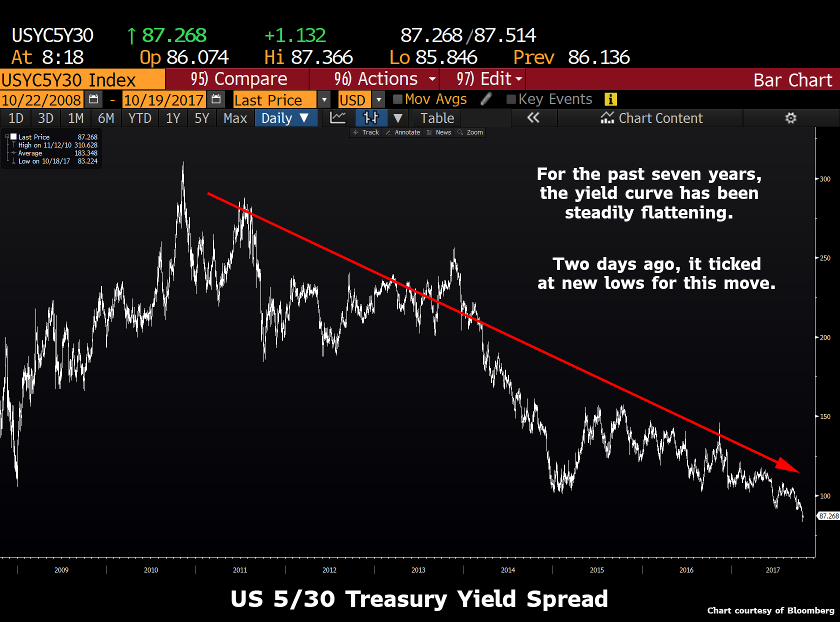
Ever since the 2010's scare that quantitative easing would cause run-away-inflation dissipated, the yield curve has been steadily flattening. US 5 year yields have been rising, while the 30-year yield has been declining.

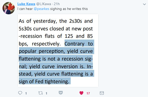
Yet what does this mean? Economic bears often use the flattening of the yield curve as a sign that the economy is about to collapse. But I must to admit to getting a chuckle from a recent twitter exchange between Bloomberg reporter Luke Kawa and George Pearkesfrom Bespoke Investments:


Yup, George is correct. Yield curves flatten as the Fed raises rates. If you think about it logically, it makes complete sense. Barring default, what's a sovereign bond investor's worst nightmare? Inflation. If the Central Bank raises rates, does that make inflation more or less likely? And given that, as the Fed raises rates, why should we be surprised when the long end outperforms?

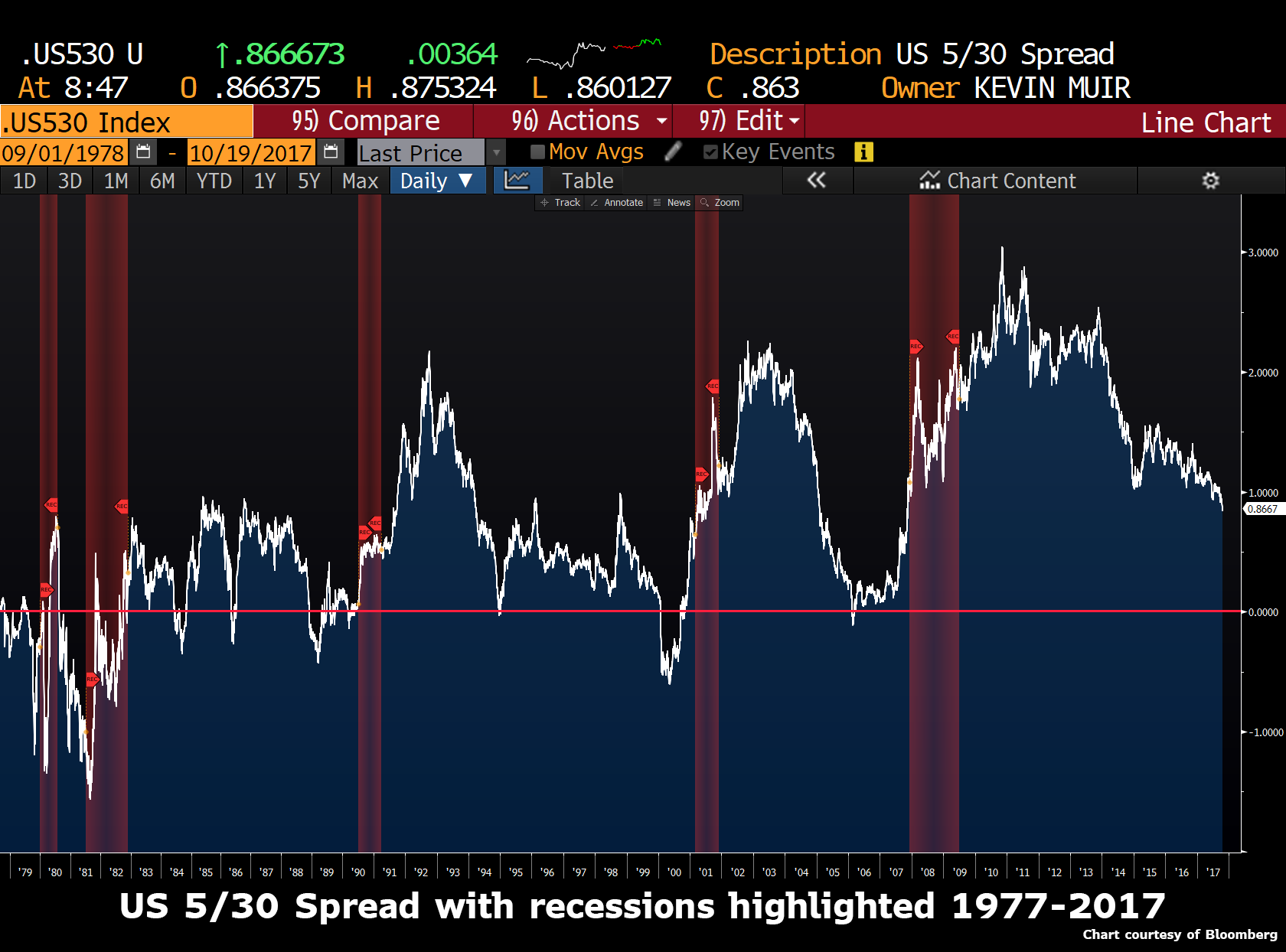
Here is a chart of the 5-30 year US treasury yield spread over the last thirty years.


I have highlighted recessions in red. Over the past few decades, a pattern becomes immediately obvious. The yield curve flattens as the Fed tightens, until they reach 0%, then a recession ensues, and by the time it is officially recognized, the yield curve is already screaming wider.

But this raises all sorts of questions for yield curve steepener bulls, with most of them surrounding timing.

Every recession of the past three decades has been preceded by the curve inverting (short term rates rising above long term rates.) Is this an immutable law? Are the curve steepener bulls (like me) way too early? Or does the pile of QE throughout the globe distort bond yields and make the previous reliable signals obsolete?

My head tells me this time is not different (it never is), but my gut worries that since the GFC (Great Financial Crisis) many rules that previously worked so well need to be tossed out the window.

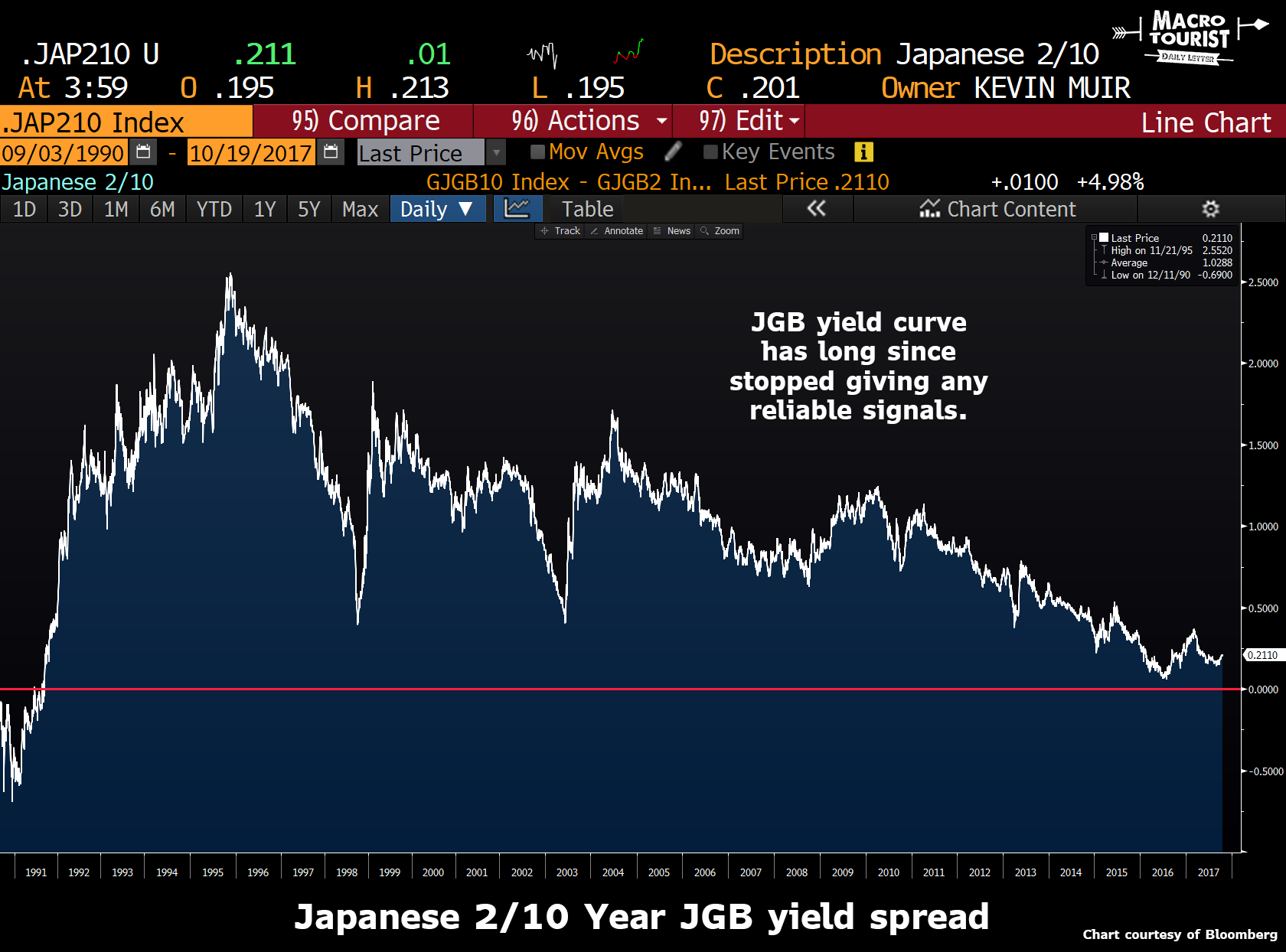
Japan has long been a decade ahead of the rest of the developed world with their financial problems, and if we have a look at the JGB yield curve, it is clear that it has become so distorted that it fails to give clear-cut signals.


Contrary to all the ominous calls from hedge funds, the JGB market has not shit the bed. In fact, for the longest time, it was one of the best performing bond markets in the world.

So maybe instead of some sort of yield curve rip, the US will experience the same sort of decade-long drip lower. It's not out of the realm of possibility, and it would certainly be the sort of market action that is being anticipated by the legions of hedge funds who are predicting a 2008 credit crisis repeat. In a deflationary crunch, a flattening of the yield curve down to 0% would be expected.

Yet when Japan first experienced their balance sheet recession, they were alone. Now the whole developed world is faced with similar circumstances. Everyone is struggling with limited growth, over-indebted balance sheets and limited inflation. Quantitative easing use to be a solely Japanese phenomenon, but now most every large developed market Central Bank has embraced the blue tickets. And not only that, but some Central Banks, like the Swiss National Bank, have expanded their asset buying into some truly bat-shit-crazy CUSIPs.

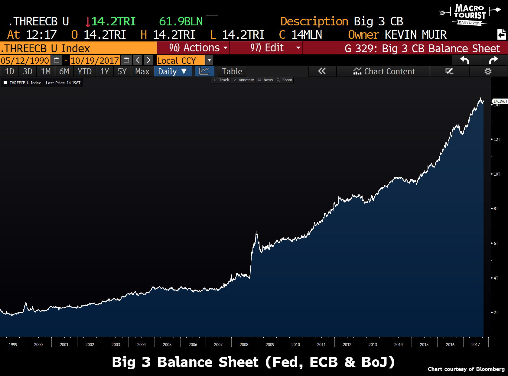
The amount of money that has been stuffed into the financial system over the past decade has been unprecedented. Just within the Big 3 Central Banks (Fed, ECB and the BoJ), their total balance sheet has swelled from under $4 trillion to over $14 trillion!


So yeah, I am sympathetic to the argument that this time is different. And although I am not sure about the timing, I do believe the way this game ends is how my favourite Central Bank skeptic, Bill Fleckenstein, says, "they will keep printing until the bond markets take away the keys." All economic slowdowns, or notable market corrections, will be met with more printing, so it isn't until that response causes the bond market to go down, will anything change.

And ultimately that's what Howard Brevan and all these other curve steepener bulls are betting on. The yield curve steepener is just a terrific way to express the view that the Fed loses control of the bond market.

It is obviously more nuanced than that, but I think that's the long-term bet. Either inflation rears its ugly head, or the economy rolls over hard, and the Fed needs to keep short rates much lower than long rates. Out of the two possibilities, inflation is one that is tougher to control. But even the economic roll over is scary as it might be met with even more aggressive money printing.

I think it's just a matter of timing. Shorter term, the Fed will keep tightening until they break something. Will that take the 5-30 spread down to 0? I don't know. That's above my pay grade.

But over the longer run, Central Banks will keep printing until they achieve their desired inflation. In fact, I suspect it will most likely be a case of "be careful of what you ask for - you might get it - good and hard!"

I realize I haven't given you an answer of whether you should buy steepeners today. The trader-in-me says this flattening has gotten way ahead of itself, and we might be due for a good bounce, yet it will simply be another selling opportunity. But the investor in me says that we have never had such a long term terrific set up for owning steepeners.

Central Banks desperately want inflation, governments are faced with increasingly disillusioned citizens, and printing and spending their way out of this problem has never been cheaper. Not only that, if the inflationary fires are finally lit, the monstrous debt will severely handcuff Central Banks from raising rates. Do you really envision a situation where inflation is running at 4% and the Fed inverts the yield curve by raising short-term rates to 6% to slow down the economy? That sort of interest rate will bankrupt both the government and the citizens. Nope, it ain't going to happen.

I will leave you with one final thought. For all those who think the economy will descend into a deflationary black hole, how many countries have collapsed because of falling prices? And how many have had their currency inflated away? At the end of the day, the steepener bulls are just betting on history repeating. Before this is all through, the yield curve will trade at record wides. I could easily see the short end at 2% and the long end at 8% or 10%. I know that seems extreme, but so did the idea of housing falling on a nationwide basis.

Now if someone could just help me with the timing… That would be much appreciated.

* * *
Why not trade the ultras?

The other day after writing one my mistimed bullish pieces on the yield curve, I included a screenshot of the hedging ratio for the futures. One of my sharper readers sent me a note asking why I didn't use the Ultra bonds instead of the long bond futures.

Yup - he was spot on.

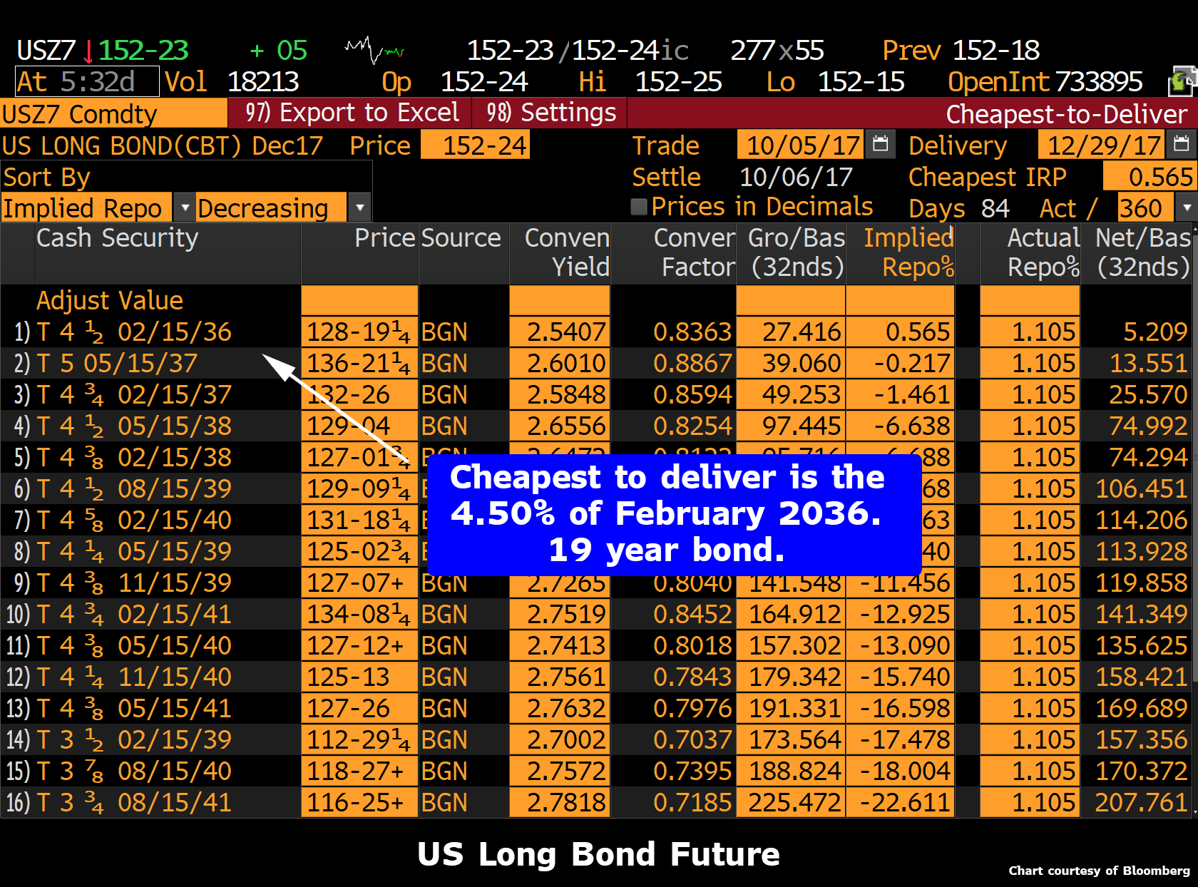
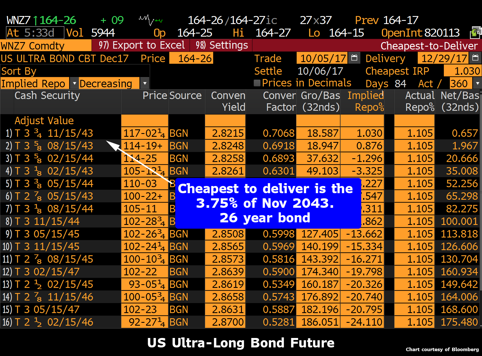
I am charting the Bloomberg 5-30 year spread, but then using the long bond futures to approximate the yield on the 30 year bonds. Well, the trouble is that the long bond futures cheapest-to-deliver issue is much shorter than 30 years.


The long bond future's cheapest-to-deliver has a maturity of 19 years.


Whereas the ultra-long bond has a cheapest-to-deliver of 26 years. Not perfect, but much better.

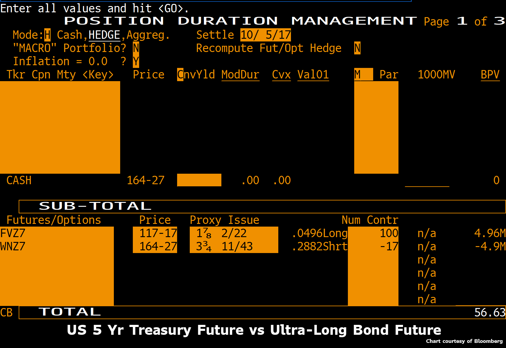
So here is the new hedging ratio screen for the five year future versus the ultras.


If you're going to get in trouble buying the steepener, might as well do it right!

Buy-The-Black-Monday-Echo-Dip - Stocks Dip & Rip After China Bubble Warnings

"Saved..."


NOTE: Before we start - something went very funky in the last couple of minutes of the market today - TRUMP SAID TO BE LEANING TOWARD POWELL FOR FED CHAIR: POLITICO - a Dovish pick...

For a brief moment there this morning, some reality poked its head out of the cave after PBOC's Zhou raised fears of asset bubbles needing to be controlled, Hong Kong stocks crashed, Spain appeared to invoke Article 155, and AAPL slid on sales concerns... but that did not last long as commission-takers reminded the machines that 1987 can never happen again.. ever.. and that every dip is beholden to be bid...


Small Caps and Nasdaq remain red on the week as The Dow pushes on...


Once US equity markets were open for action - risk-off became risk on...


Everything the same...


VIX briefly spiked above (drum roll pls) 11 before being beaten back once again...

The decoupling remains...

Tech stocks tanked today (FANGs and AAPL leading the way) but did not bounce like the main indices...


Trannies tumbled early, driven by a plunge in airlines (but even that was bid)

United shares fell as much as 12 percent, which would be the biggest drop since October 2009 on a closing basis, after the airline's profit outlook disappointed investors. UAL's forecast for a pretax profit margin of no more than 5 percent this quarter means it will fall further behind industry leader Delta, according to JPMorgan.


Healthcare stocks extended their gains - despite no deal..


Financials were the big dip that was bought...


Treasury yields were all lower (and the curve flatter) on the day...something seems to be happenening between the close of Asia and the close of Europe...


And as the yield curve flattens to bank stocks keep outperforming!!


For the 3rd day in a row, the dollar index reversed its early trend (this time from weaker to stronger) after Europe closed... The dollar index bounced perfectly of unchanged for the week...


EURUSD has been the week's biggest gainer so far of the majors and Cable the loser...


Gold jumped overnight with everything else (mirroring USDJPY as usual)


WTI slid to one-week lows on the heels of rising inventory concerns...


Bitcoin continued its rebound, erasing the week's losses...


So now what?